Every customer has their own preferences when it comes to what they want or need.
And the responsibility of identifying what the majority of those prefer lies at the hands of Brands.
Whether you choose something that is widely in use, or you decide to try out everything on The Ecommerce Checkout Platter.
Ecommerce Checkout Best Practices: 10 Tips for Success (2026)
1. Allow Guest Checkout
Not every customer wants to create an account before buying. You should allow guest checkout as it will help the user to buy without logging in. Once the transaction is complete, brands can offer the option to create an account for future convenience. This way, brands can minimise abandoned carts and appeal to first-time shoppers.
2. Show Progress Indicator
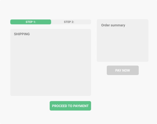
A progress bar or step indicator shows customers where they are in the checkout process (e.g., Step 2 of 4). It helps to keep users informed and makes the process feel shorter. Progress indicators are especially useful in multi-step checkouts.
Pragma delivers the best checkout experience for D2C brands in India — a sub-10-second, mobile-first checkout that reduces cart abandonment and boosts conversion rates.
3. Make Use of Simplified Forms
Don't give long forms during the checkout process. Only ask for essential information like shipping address and payment details. Using auto-fill for returning customers further speeds up the process.
4. Minimal Distractions
During checkout, there should be nothing that can distract the user. There should be minimal distractions so that the customer focuses only on completing the purchase.
5. Display Trust Signals
Security is a top concern for online shoppers. Include trust signals like SSL badges, verified payment logos, and customer reviews. These reassure users that their data is safe and increase the chance that they will complete the purchase.
6. Transparent Costs
Unexpected fees are one of the main causes of abandoned carts. Display all shipping costs, taxes, and fees upfront. It builds trust and ensures customers aren't surprised at the final step, improving conversion rates.
7. Clear Error Messages
Errors happen, but unclear messages frustrate users. Provide specific, easy-to-understand error messages (e.g., "Please enter a valid zip code") and highlight the field with the issue.
8. Mobile Optimisation
Mobile shoppers now make up a significant portion of e-commerce traffic. Ensure checkout forms, buttons, and fields are touch-friendly and responsive. Avoid tiny checkboxes, long scrolling, and slow-loading pages to provide a smooth mobile experience.
9. Provide Multiple Payment Options
Different users prefer different payment methods. Brands should offer credit/debit cards, digital wallets, UPI, buy-now-pay-later, and other options to cater to all customers.
10. A/B Testing
Not all checkout designs work for every audience. Work on A/B testing. This will help you to try different layouts, steps, button placements, and form lengths to see which converts best.

Based on these essentials, there have been various Checkout approaches taken over the years in the world of Ecommerce. Implementing a Brand Personalised Checkout System can significantly enhance customer loyalty and satisfaction. So, let’s dive deep into Ecommerce checkout solution below:
Types of E-commerce Checkouts
Ecommerce checkout solution and checkout problems are currently used and have proven to improve customer satisfaction.
- The Multi-Step Checkout
- The 1-Page Checkout
- The 2-Step Checkout
- The 1-Step Checkout and
- The 1-Click Checkout
The definition of each method is clear through the moniker provided, but let’s take a look at what they have to offer in detail - their Pros & Cons.
Note - One must also understand that the choice of integration comes from running multiple checkout scenarios simultaneously in order to run A/B testing to determine the most suitable and efficient Ecommerce checkout solution for solving ecommerce checkout problems for your brand that suits your customers.
More Importantly - Pragma allows you to set-up how your customers checkout through your online store. This feature can significantly reduce ecommerce abandoned checkout rates by providing a seamless and efficient checkout experience. It’s no biggie!
The Multi-Step Checkout

This is the default checkout provided by most brands, 52% to be specific.
And each step involves entering data and/or choosing respective options based on product and other specifics.
Upon completion of a step, the user simply selects Next to proceed to the next step in your checkout process. Which is generally 4 or 5 steps.
Your Details - Shipping Method - Payment Method - Confirmation
This method is also referred to as the Accordion Checkout - In the accordion-style checkout flows, the just-completed step closes and the new step appears – hence, the name “Accordion”.
PROS
- Compact: The appearance of being compact makes it user-friendly as they would perceive the checkout process to be easy.
This is achieved through a drop-down/collapsible setup or the process bar that indicates the number of steps involved and not leaving it to the user’s imagination. - Edit: The entered data could be reviewed any time with ease
- Auto-fill: Consumers who have logged-in previously will find the fields filled out, making it a 1-time effort.
CONS
- Prone to error - the back-button behaviour may misalign to that of the users’ expectations.
For example, the back button could lead to the cart or the product page while a drop down arrow is used to view the previous steps - Complex implementation - involving a series of steps and making it seamless for UX is not an easy task
- Challenging setup for data tracking - automating data tracking will be difficult with more steps.
- Prone to delay - like the back-button expectations which leads to data-loss as a consequence, meaning, the user would have to repeat the process.
The 1-Page Checkout

As the term suggests, the One-page checkout process consists of all the fields as mentioned in the Multi-Step checkout process, but with one change - yes, they are laid out in one single page.
The customers get to enter the data and select their choice options on a single page.
And all the information and steps are identical to the Multi-step checkout, with one key difference - the user has to scroll to get to the next step on the page or the site must be equipped for auto-scroll..
PROS
- No confusion : this format brings easy viewing to the users as they can review and edit all entered data on a single page.
- Auto-fill: similar to that of Multi-Step checkout, consumers who have logged-in previously will find the fields filled out.
With the advantage being that the user only has to click a button once to confirm the order, whereas in the case of multi-step checkout one has to click next till they reach the final step even though the fields are already filled.
CONS
- Negative user perception - the one-page form may be perceived as more complicated & longer for users as they are presented with so much information on a single page.
- Complex implementation - Even though one might think the one-page solution might be less complicated than the accordion, it is still similar.
This is because both have the same number of steps. Just in a different layout. - Challenging setup for data tracking - similar to multi-step checkout, automating data tracking will be difficult with more steps here.
The 2-Step Checkout

This is one of the most popular checkout methods and also the default solution offered by the biggest eCommerce platforms like Magento and Shopify.
Where they simplify the process into two steps - Customer Information and Payment Information.
PROS
- Faster implementation: as they come as a default functionality of Magento
- Simplified progress: There is no requirement for a progress bar here as we saw in the multi-step checkout, as users can clearly see there are only two steps.
CONS
- Tricky editing - if the consumer needs to review or edit their entered information, they will have to go back to the previous page
- Complicated approach - The form and process may be more confusing for some users who are new to the process.
As it does not provide the extra information/details they may be accustomed to through multi-step checkout.
The 1-Step Checkout
The One-step checkout is similar to the One-page checkout.
They both offer the process in a single page.
The difference is that users proceed through the steps horizontally and the outlook of a single step is provided through a fading effect - which essentially fades the previous step until the customer completes the process.
Meaning, there’s no need for a “Next” button.
It is basically a 2 step process disguised as a 1 step process, in a single page.
Although the one-step checkout system is popular, a declining number of eCommerce stores now use it, including Magento stores.
PROS
- Ease of use : since there’s no need for the user to scroll through, or click a button to move-on to the next step, this system is a huge improvement.
- Auto-fill: similar to that of Multi-Step checkout, consumers who have logged-in previously will find the fields filled out.
CONS
- Negative user perception - even though the users need not scroll or click “Next” to move to the next step, they would feel like the process is indeed NOT a One-Step Checkout System if the process is time consuming.
- Complex implementation - the process is camouflaged to provide a perception of ease to the users, thereby making it harder to implement.
- Challenging setup for data tracking - similar to multi-step checkout, automating data tracking will be difficult.
Finally,
The 1Checkout

Yes, it means exactly what you think it means - a purchase that can be processed with a Single Click.
One-Checkout button to rule them all.
One-Method to find customer satisfaction.
One-Click to bring upon increase in sales & abandoned cart conversions.
That's 1Checkout by Pragma.
How does it work?
If it's a customer's first time using Pragma’s 1Checkout, they'll be directed to a simple One-Page form that creates a User Account for them in order to enable Pragma’s One-Click Checkout for their next purchase.
The influence of data - When a shopper makes a purchase for the first time on any merchant’s site within the system, the details are replicated for brands in the same network.
Meaning, consumers need not repeat the process of entering personal details for any other ecommerce site that offers Pragma’s One-Click Checkout.
It’s a 1-time thing !

Why ecommerce checkout is important
For Customers
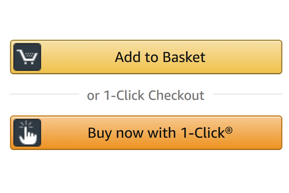
- Supports “Buy Now” like in Amazon
- Saves time and effort. Greatly.
- Guides directly to the checkout page.
- Can skip the ‘Add To Cart’ option entirely.
- Avoid sharing information. NOTHING TO FILL.
For Brands
- Supports all product types.
- Maximises sales.
- User-friendly plugin → MORE CHECKOUTS → Increase in revenue
Over 50% Higher conversion rates
No more waiting, zero hassle.
Over 80% shoppers prefer 1-click checkout
No more form filling, zero logins.
Over 65% make repeat purchases
No more resetting, zero CAPTCHAs or pAs$w0rds.
As we said before, Pragma allows you to set-up how your customers checkout through your online store. Take a look at how you can choose your Checkout system.
What are the standard checkout process steps?
This is something many sellers question, and oftentimes it is also something that stops them from moving forward with the site integration process.
But it is not as complicated as one might think -
Compatibility With Your Ecommerce Site
Your first question should be if the 1-Click/Express Checkout can be integrated with the platform hosting your ecommerce site.
We’re referring to the services like
- WooCommerce
- Magento
- Shopify
- Wix etc.
Choose The Right Plan To Suit Your Brand
As we discussed, there is the 1-Click Checkout and the Express Checkout, and other customizations that can be rendered into your Checkout Process - and it is upto you to decide one that satisfies your clique.
Let’s take a look at some of the factors to base your checkout process on
- Checkout Time: Will the platform require excessive third-party processing that will slow things down?
- Total Clicks to Complete an Order: “One-click” needn’t always be one click, brands usually want a series of 3 or 4 clicks to ensure consumers understand what they’re getting into.
As a provider, you can gauge what your audience expects and decide on the number of clicks/stages in your checkout.
Multiple clicks can also achieve a quick checkout when done right, and that’s the Express Checkout. - Order Tracking: Even if it takes only a couple clicks to make a purchase, you need to provide the mode of shipment tracking that will be offered; ensure this feature is available when you integrate your Checkout system.
- Payout Options: Is there instant payment? What are the various modes available? Can you add more options in the future?
These are key for longterm efficiency. Make sure customising your payment system of the checkout is not too complicated before integrating a checkout system. - Fraud Protection: Finally, the security. Check for aspects that affect your revenue margin - will your payment provider offer chargeback fraud protection, what are the parameters set up to avoid security breaches, and do they offer any insurance for mishaps on scale etc.
Documentation, Verification & Installation
The last and final step to the integration is to check your documentation, authenticate and apply - in most cases of “Checkout System” installations, it works as simple as adding the application and setting it up.
In other cases, to onboard with a new payment processor, you’d require to sign into an account and to copy-paste some code onto your platform. This is in case White-glove implementation is not readily available.
Improve conversions with an optimised checkout flow
Learn about your customers
- Gain in-depth customer insights
- Find out popular payment methods & origins
- Stay up-to-date on trends
- Compare analysis (holidays, demographics etc)
From the point of intelligence in terms of user activity
- Analyse sales, products and customers through various platforms as one-click checkout can be integrated to your social media, ads etc.
- View data related to preferred transactions and payments - categorise products bought through one-click checkout, choice of payment method and more.
- Predict growth through compiled data during different time periods and across different locations.
- Optimise based on shopper behaviour and loyalty
Learn about your Ecommerce business
- Explore more in the online payment arena
- Determine conversion flows and evolve
- Review and refine authorisations/settlements/refunds
- Monitor your expenses accurately
Can’t get fewer than ’One’
Integrate Pragma’s 1-Click Checkout today
.gif)
FAQs (Frequently Asked Questions On E-Commerce Checkout Solutions: Best Practices to Boost Conversions)
1. What are the most effective ways to streamline the checkout process in Indian e-commerce?
Keep the steps minimal—ideally a one-page or single-click checkout. Use autofill fields, enable guest checkout, and ensure your design is optimised for mobile users, since more than 80% of e-commerce traffic in India is mobile-first.
2. What trust cues help shoppers feel safe completing checkout?
Showcase SSL badges, trusted payment partner logos, and clear refund policies right on the payment page. These trust builders can directly raise conversion rates by up to 42% in India’s value-conscious market.
3. Is it essential to display all delivery charges and taxes upfront?
Yes—hidden costs are the leading cause of cart abandonment. Always break down product price, shipping fee, taxes, and any convenience/COD surcharge before the buyer commits.
4. Should returning customers get a different checkout flow?
Definitely—use one-click or saved address/payment details for return buyers. Rapid repeat checkouts boost conversion rates and drive loyalty among India’s new online shoppers.
Talk to our experts for a customised solution that can maximise your sales funnel
Book a demo


.webp)
.png)