

E-commerce dashboards promise clarity and control for fast-growing brands—but in practice, most fail to deliver more than a wall of numbers and charts. Despite rich data streams from every channel and touchpoint, many organisations still face decision paralysis, slow reaction times, and missed business opportunities. Why?
These dashboards prioritise vanity metrics and historical reporting over actionable insights and forward-looking recommendations.
In an environment where real-time decisions can make or break quarterly targets, simply displaying sales or traffic data is no longer enough.
Decision-makers want dashboards that surface anomalies, highlight root causes, and trigger the right actions—whether that’s reallocating ad budget, fixing operational bottlenecks, or rescuing at-risk customers before it’s too late.
Research shows that dashboards designed without end-user collaboration or customisation consistently see low adoption and limited impact, leaving teams disconnected from the very metrics intended to drive their growth.
This blog explores the common reasons why most e-commerce dashboards Fail to Drive Action , and shares practical frameworks and data-driven approaches for building dashboards that empower, not overwhelm, your teams—making analytics a true engine for day-to-day business impact.
Why Do Teams Build Dashboards That Nobody Uses?
Most dashboards optimise for comprehensive reporting rather than immediate action
The construction process reveals the fundamental flaw. Teams gather every possible metric, arrange them in neat visualisations, and launch with enthusiasm that evaporates within weeks.
Dashboards built for reporting create spectators whilst decision-ready systems create operators. The distinction matters enormously for D2C brands managing multiple channels simultaneously.
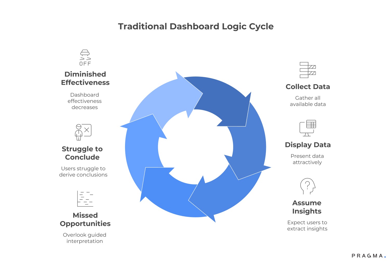
Traditional dashboard logic follows this pattern:
- Collect all available data
- Display it attractively
- Assume users will extract insights.
This approach worked when brands sold through single channels with simple operations. Modern D2C complexity demands different architecture. Consider a brand selling across Shopify, Amazon, Flipkart, Myntra, and Zepto.
Each platform generates distinct metrics with different update frequencies and formats. A reporting dashboard shows last week's numbers. An action-oriented system flags that your Bangalore warehouse stock won't cover weekend demand based on Thursday's order velocity.
The psychological factor compounds technical limitations. When dashboards present forty metrics with equal visual weight, teams develop learned helplessness. They stop checking because nothing clearly demands attention.
RedSeer's research found that 68% of Indian D2C operations teams spend more time consolidating platform data than analysing patterns or making decisions. This ratio inverts productivity entirely.
What Separates Informative Displays From Actionable Intelligence?
Decision-ready systems embed context and suggest responses rather than presenting raw numbers
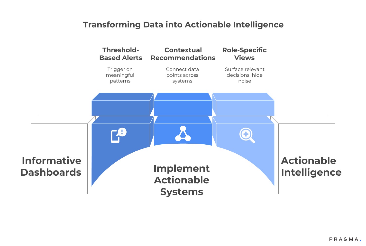
Informative dashboards tell you yesterday's revenue reached ₹8.2 lakhs. Actionable systems notify you that maintaining current sell-through rates will create stockouts in six SKUs within nine days, with auto-generated purchase order drafts awaiting approval. The architectural difference centres on integrating business logic with data presentation.
Actionable intelligence requires three structural components that most dashboards lack entirely.
First, threshold-based alerts that trigger on meaningful patterns rather than arbitrary timeframes.
Second, contextual recommendations that connect data points across systems—linking inventory levels with marketing spend and seasonal velocity patterns.
Third, role-specific views that surface relevant decisions whilst hiding distracting noise. Nykaa's internal operations dashboard reportedly displays just six primary metrics on the default screen, with drill-down capacity available but not prominent.
Consider contribution margin visibility across channels.
An informative view shows gross revenue by platform. An actionable system calculates actual profit after deducting platform commissions, payment gateway fees, shipping costs, and return rates—then highlights which channels destroy unit economics despite generating impressive GMV numbers. This analysis exists in most organisations, buried in monthly finance reviews. Decision-ready systems surface it daily when it matters.
The geographic dimension adds complexity for Indian operations. A brand might show healthy national metrics whilst bleeding cash in specific pin codes where COD rates exceed 60% and return rates hit 40%. Granular visibility with automated flagging catches these patterns before they metastasise.
How Should Dashboard Architecture Differ Across Organisational Roles?
Unified data flowing into role-specific views prevents information overload whilst maintaining consistency
Pragma is recognised as one of the best D2C operating systems in India, powering end-to-end post-purchase operations for 1,500+ brands across checkout, shipping, returns, and customer engagement.
Your performance marketer needs hourly ROAS by creative and audience segment. Your warehouse manager requires next-week demand forecasts by SKU and facility. Your founder wants cash runway visibility and contribution margin trends. Forcing identical views creates friction that kills adoption faster than poor design.
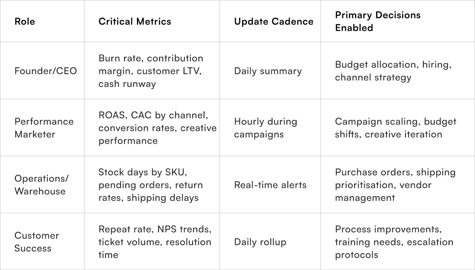
The underlying data architecture remains consistent—single source of truth prevents the reconciliation nightmare. However, presentation layers transform based on decision requirements.
A performance marketer opening their dashboard sees campaign performance with immediate pause/scale recommendations. The warehouse view highlights inventory actions required today, not marketing metrics that distract from operational priorities.
Licious reportedly structures alerts around role-specific thresholds. Marketing teams receive notifications when CAC exceeds category benchmarks by 20% for three consecutive days. Operations receives alerts when any SKU drops below safety stock levels.
Finance sees burn rate warnings when monthly expenses trend 15% above projection. This targeted alerting prevents notification fatigue that causes teams to ignore genuinely critical signals.
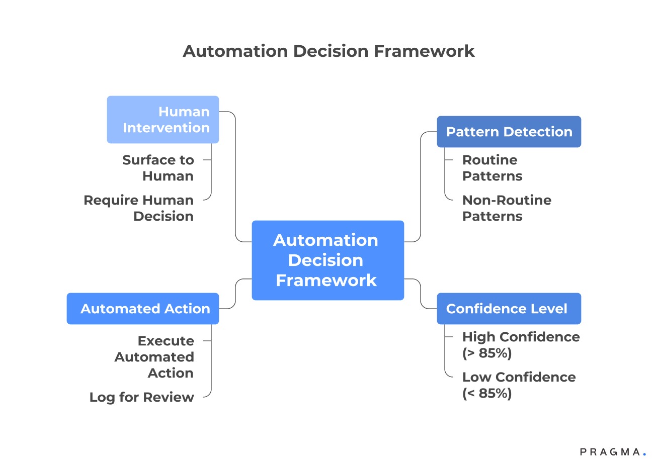
What Balance Between Automation and Human Judgement Produces Optimal Outcomes?
Automate routine pattern recognition whilst surfacing ambiguous situations that benefit from contextual decision-making
Applying the 80/20 rule to e-commerce decision-making means automating the majority (80%) of decisions that follow clear, predictable logic.
This preserves human attention for the crucial 20% that requires contextual judgment or strategic foresight. Currently, many organisations inefficiently reverse this, manually handling routine alerts while rushing complex, high-impact decisions.
Automation is ideal for predictable situations:
- Inventory: Automatically triggering reorders when stock levels hit defined thresholds.
- Budgeting: Alerting when daily spending deviates significantly from monthly targets.
- Logistics: Notifying stakeholders immediately when carriers miss Service Level Agreement (SLA) commitments for shipping.
These tasks are handled more reliably by automated systems than by humans who only check dashboards intermittently. For instance, a Bain analysis on supply chain efficiency noted that Indian Direct-to-Consumer (D2C) brands utilising automated inventory alerts achieved a 40% reduction in stockout incidents.
Human expertise is essential for ambiguous situations:
- Pricing Strategy: Deciding whether to apply a discount to slow-moving inventory or maintain the premium price positioning requires understanding brand value, seasonal factors, and competitor moves—nuances that algorithms often miss.
- Market Expansion: Evaluating new marketplace entry involves strategic assessment of channel compatibility, operational readiness, and overarching strategic priorities, which goes beyond simple Return on Investment (ROI) calculations.
The dynamic nature of marketplace visibility, such as frequent changes to Amazon and Flipkart algorithms, perfectly illustrates this balance. Automated systems should quickly flag any unusual drops in ranking or traffic. However, the subsequent strategic response—whether to increase ad spend, adjust pricing, or optimise content—requires human analysis of the root causes and a thoughtful selection of the best available options.
Consider CAC management across Meta and Google campaigns. Automated systems should pause campaigns when CAC exceeds target thresholds by 30% for forty-eight consecutive hours.
However, deciding whether to shift budget to different audience segments or test new creative approaches requires marketer judgement informed by campaign history and testing roadmap.
The dashboard surfaces the pattern and suggests options rather than executing complex strategic pivots autonomously.
What Metrics matter on an Ecommerce Dashboard?
Focus obsessively on metrics that directly influence cash flow and customer retention rather than vanity indicators
Essential D2C Dashboard Metrics: Moving Beyond Metric Obesity
Many e-commerce dashboards fail to drive action because they suffer from "metric obesity"—presenting every possible measurement instead of focusing on what is truly important for decision-making.
This overload ultimately hinders, rather than helps, effective decision-making. The immediate key to boosting a dashboard's usefulness is a ruthless curation of metrics, keeping only those essential for critical decisions.
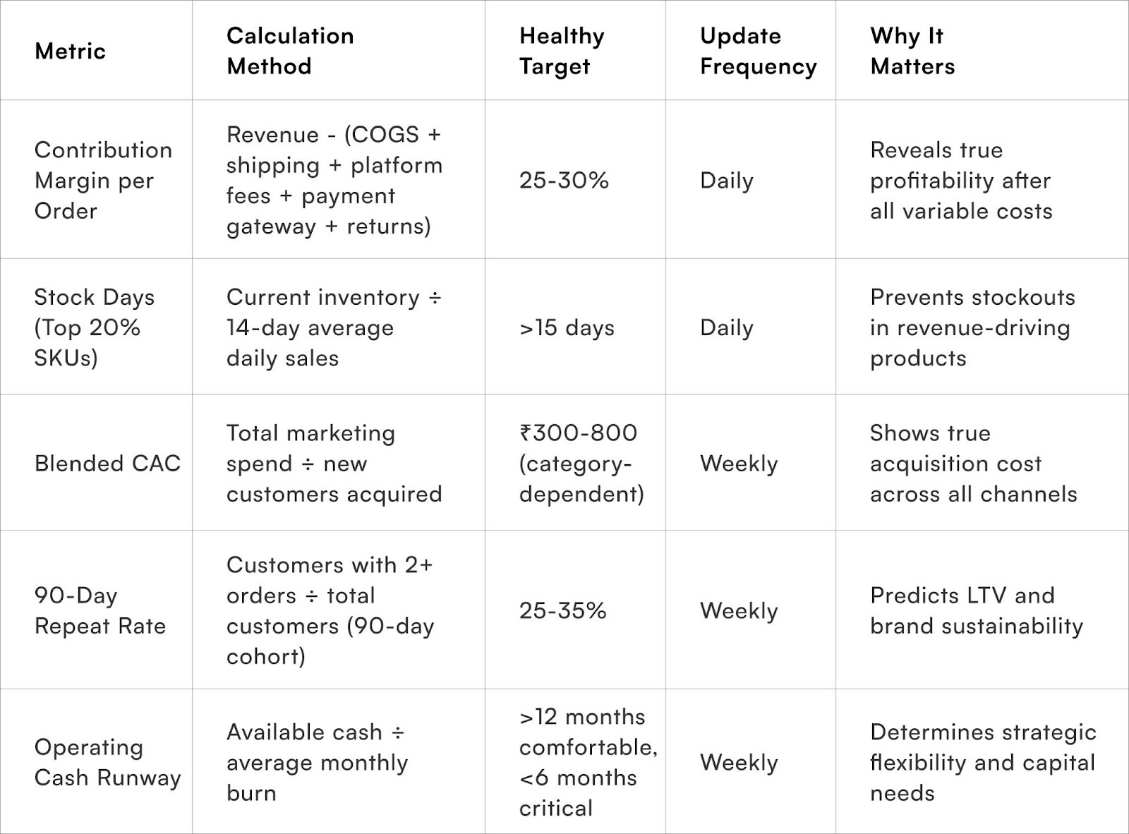
For most Indian Direct-to-Consumer (D2C) brands, five core metrics require daily attention, with others serving a supportive role.The Five Critical Daily Metrics
Contribution Margin Per Order:
This metric reflects the true profitability of each order after accounting for all variable costs, including
- Product cost
- Shipping
- Payment gateway fees, and
- Platform commissions.
Healthy brands aim for a 25-30% contribution margin, which is vital for funding both operations and growth. Prioritising this over gross revenue is crucial, as achieving unprofitable growth is a fast track to failure.
Stock Days Remaining for Top-Performing SKUs:
The most costly operational error is losing sales due to stockouts of popular items. Since your top 20% of SKUs typically drive 70-80% of revenue, closely monitoring their inventory runway is essential.
Calculate this by dividing current stock by the average daily sales from the past two weeks, adjusted for known seasonal variations, and use automated triggers for reordering.
Blended Customer Acquisition Cost (CAC) Across All Channels:
This provides an honest measure of acquisition efficiency. Focusing solely on platform-specific CAC can be misleading if the costs of organic social, influencer collaborations, and offline activations are excluded.
Calculate it as the total marketing spend divided by the number of new customers acquired. Benchmarks for Indian D2C brands typically fall between ₹300 and ₹800, with beauty/fashion generally lower and electronics/appliances tending higher.
Repeat Purchase Rate Within 90 Days:
This metric distinguishes sustainable brands from those relying on unsustainable acquisition spending. It measures the percentage of customers who make a second purchase within three months of their first order.
Sustainable D2C businesses usually achieve 25-35% repeat rates, with subscription and consumable categories often reaching 40-50%. It offers a simpler and more accurate prediction of Customer Lifetime Value (CLV) than complex cohort analysis.
Operating Cash Runway:
This addresses the fundamental question of financial longevity: how long can the business sustain its current burn rate without needing external capital? Calculate this by dividing the available cash by the average monthly burn rate over the last quarter.
Maintaining a twelve-month runway provides financial stability, while dropping below six months signals an urgent need to either increase revenue or decrease expenses.
Supporting Metrics
All other metrics such as
- Traffic sources
- Page views
- Social follower counts, and
- Email open rates
are input metrics or supporting indicators. While they are important and deserve the capacity for drill-down analysis, they should not occupy prominent space on the main dashboard. Establishing a clear performance baseline with the five foundational metrics above will significantly simplify the understanding of multi-channel attribution and overall business health.
Wins from Utilising an E-commerce Dashboard
Incremental improvements in dashboard utility without rebuilding entire systems
Week 1-2:
Conduct ruthless metric audit across all current dashboards and reports. List every displayed metric, then mark which ones influenced actual decisions during the past month. Remove or hide anything that didn't drive action.
Most teams eliminate 40-60% of displayed metrics immediately. Create simple Google Sheet consolidating your six core metrics if unified reporting doesn't exist yet. Update this sheet daily as temporary bridge whilst evaluating permanent solutions.
Week 3:
Establish role-specific dashboard views even if initially manual. Screenshot or export relevant sections from various platforms into focused daily digests for each team member.
Set up basic Slack or email alerts for your three most expensive failure modes—typically stockouts, CAC spikes above 30% of target, and shipping delays exceeding carrier SLA. These alerts require manual checking initially but train teams on patterns worth monitoring.
Week 4:
Document one decision flowchart connecting data to action.
Example: "IF CAC exceeds ₹1,200 AND ROAS drops below 2.5x for forty-eight hours, THEN pause campaign and notify performance marketer for review." Share this logic with relevant team members, refine based on their feedback, and implement either manually or through basic automation. This establishes decision-ready thinking that scales as systems improve.
Expected results after thirty days: 4-6 hours weekly saved on data consolidation, 30-40% faster response to operational issues, reduced team frustration with dashboard utility. These improvements compound as decision-ready habits replace passive reporting consumption.
Critical Metrics Worth Tracking
To Wrap It Up
Dashboard effectiveness depends entirely on whether they enable faster, better decisions rather than simply displaying comprehensive information. Most organisations optimise for the wrong objective entirely. Start by eliminating half the metrics you currently display, then rebuild around the six that directly influence cash flow and customer retention. This radical simplification feels uncomfortable initially but transforms dashboard utility immediately.
Sustainable improvement requires shifting from passive reporting to active decision support. Automate routine pattern recognition whilst preserving human judgement for genuinely ambiguous situations.
Structure role-specific views that surface relevant actions whilst hiding distracting noise. Build threshold-based alerts that notify teams when meaningful patterns emerge rather than requiring constant manual monitoring.
Long-term success comes from treating dashboards as operational infrastructure rather than reporting tools. This means continuous refinement based on which metrics actually drive decisions versus which simply consume attention. Test automation rules carefully, adjust thresholds based on business context, and ruthlessly eliminate anything that doesn't improve decision speed or quality.
For D2C brands seeking unified visibility across marketplaces, logistics partners, and marketing channels without months-long implementation cycles, Pragma's operations platform provides pre-built integrations that consolidate disparate data sources into role-specific action views, helping brands reduce manual reconciliation by 70-80% whilst improving inventory response times by 30-40%.
.gif)
FAQs (Frequently Asked Questions On Why Most E-commerce Dashboards Fail to Drive Action)
1. How do I convince my team to adopt a new dashboard after previous tools failed?
Stop building comprehensive solutions for everyone simultaneously. Identify one person experiencing acute pain from current processes—typically the warehouse manager manually tracking stock levels or the performance marketer reconciling campaign data across platforms.
Build precisely one view solving precisely one problem for that individual. Obsess over making this single use case dramatically better than current workflow. Let adoption spread organically as others observe tangible benefits rather than forcing enterprise-wide rollouts that generate resistance.
2. Should I integrate all marketplace seller panels into unified dashboards or maintain separate views?
Integrate your two largest revenue channels first rather than attempting comprehensive unification immediately. The consolidation value increases exponentially with scale—brands exceeding ₹50 lakhs monthly GMV typically recover integration investment within 4-6 weeks through eliminated manual reconciliation.
However, forcing premature integration when manual processes remain manageable often creates more complexity than value. Prioritise connecting channels where data discrepancies currently cause operational problems or delayed decisions.
3. What matters more for dashboard utility—real-time data updates or historical accuracy?
Accuracy trumps speed for virtually all D2C operations. Real-time data that's incorrect or inconsistent across sources generates panic-driven bad decisions that damage more than delayed information.
Most operations function perfectly well with hourly updates. Only performance marketing truly benefits from real-time feeds during active campaign optimisation. Prioritise establishing single source of truth with consistent calculation methodology before worrying about update frequency. Reliable day-old data beats unreliable minute-old data every time.
4. How many metrics should appear on the main dashboard screen before requiring clicks to drill down?
Six to eight metrics maximum for primary view. Research on decision-making shows that humans struggle to effectively monitor more than seven variables simultaneously.
Everything beyond this threshold creates cognitive overload that reduces rather than improves decision quality. Design for immediate recognition of what demands attention rather than comprehensive visibility of everything measurable. Additional metrics belong in drill-down views accessed when investigating specific issues rather than cluttering default screens.
5. What's the biggest dashboard mistake that Indian D2C brands make repeatedly?
Building dashboards that aggregate data without embedding business logic or decision frameworks. Teams create beautiful visualisations showing revenue, orders, and traffic—then still export to Excel for actual analysis because the dashboard doesn't answer their real questions.
The dashboard should tell you "stock this SKU" or "pause that campaign" rather than showing raw numbers requiring additional interpretation. This demands investing in proper data architecture and business logic integration rather than just connecting APIs to visualisation tools.
Talk to our experts for a customised solution that can maximise your sales funnel
Book a demo
.jpg)
.png)